10 Tips On Kerning And Metrics
[2026/09/18] Very old article, rewritten. The overall corpus is preserved, with added notes and edits.
As the title suggests, this is a brief collection of quick tips on kerning and metrics that I find valuable.
Although aimed at type designers, this article might be valuable for kerning in DTP software or for logo designers. Anything that has to do with letters, perhaps.
1. Proper Spacing Means Less Kerning
This should be a no-brainer. If your font’s metrics look good overall, there’s less stuff to kern.
So, try to keep your metrics as consistent as you can, well overshot, and only go for kerning when there’s no other way to space it better. I usually keep spacing glyphs as I am drawing them. I’m looking to see if there is good flow, if the rhythm is precise and if I can solve some spacing problems in the letterform itself1.
2. Classes
Use kerning classes. They exist and are a time-saver.
In case you are wondering why, it’s just easier to grab a bunch of glyphs of the same group (for example a and all it’s diacritic marks), assigning them to the same kerning class, and kerning them. This skips most of pair-by-pair kerning. Even if you have to deal with some collisions, it’s a lot less work.
3. Kern First, Ligatures Afterwards
As much as kerning is tedious and I love to push it to the end of the production, it’s not a bad idea to do the ligatures after you’ve already spaced and kerned the glyphs in question: in that way, you avoid having to correct bad spacing to your ligatures, saving you some time and some eyeballing doubts.
4. Mirroring
Mirror, mirror, mirror. Horizontal and vertically. At the same time and with just one axis mirrored.
The goal here is for you to step away from reading as more as you can, trying to only see form. Approach the design as an abstract composition and it gets easier to balance the spacing.
And this is not just for kerning and spacing: mirroring and flipping makes oddities obvious in any kind of composition.
5. Straight Neighbours, Round Neighbours
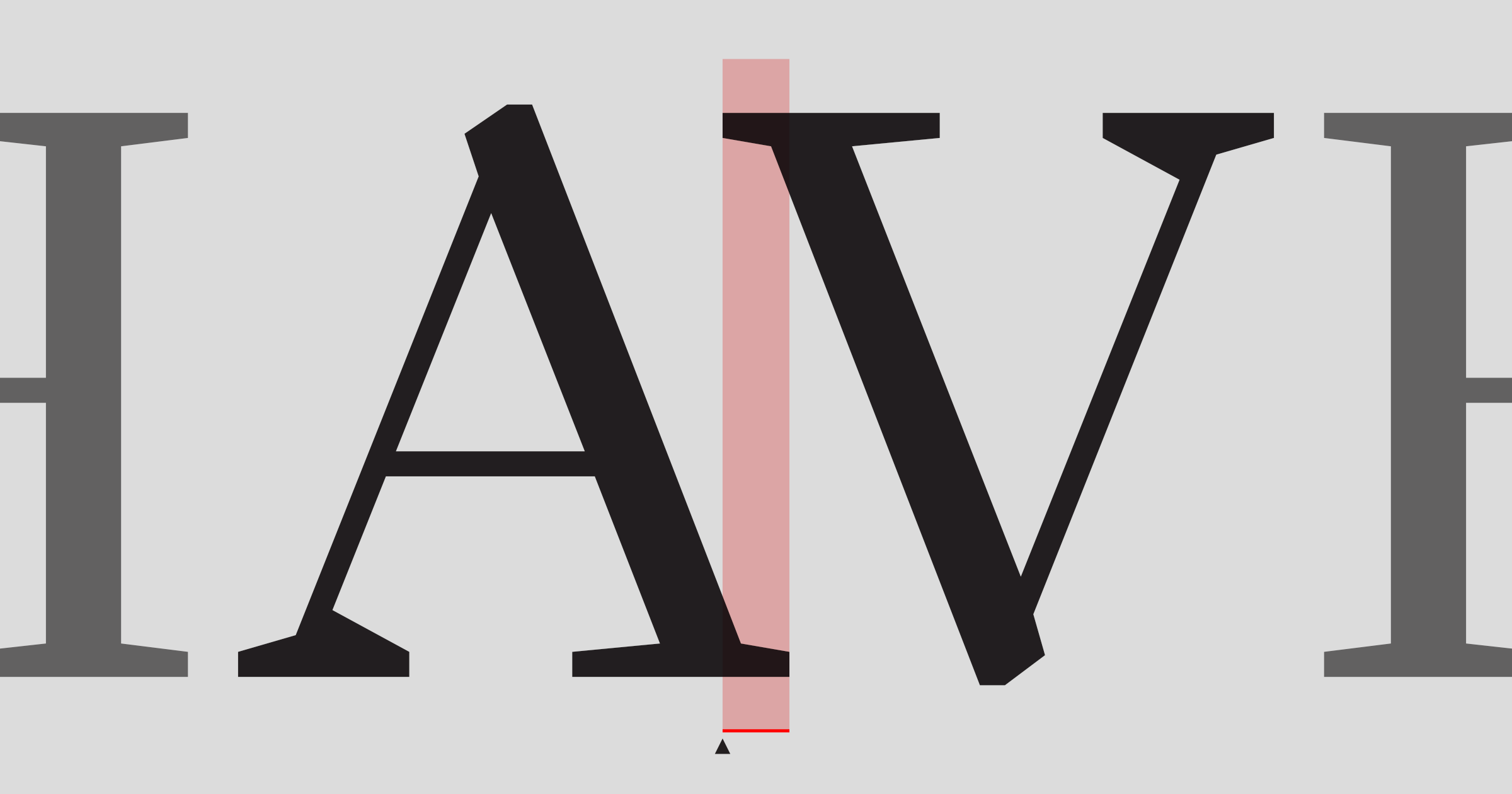
Before going for text-string kerning (I use Just Another Foundy‘s Just Another Text Generator, by the way)2, I start with straight and round neighbours (and/or a mix of both) in both sides of the pair I’m working on.
For example, if I’m kerning A/V, I’ll have something like HHAVHH OOAVOO HOHAVHOH.
6. Pay Attention To The Space’s Width
This one is often neglected.
Most of the times, if you space your sidebearings right while you’re drawing, usually you don’t have to kern the space glyph at all. So, you have three options:
- Set your space width and do your metrics accordingly;
- Do your metrics and set the space width accordingly;
- Ping-pong between the two.
In my opinion, go for option number 3.
Metrics and kerning deal with the space between letters — and that includes the space glyph.
Edit: OK, I kind of lied, here. If we think of just letters, this applies — typefaces, however, are way more than just letters. Punctuation, symbols, sub and superscript glyphs all need special attention when intercombined, since they already add to the overall whitespace, making the space between words bigger when these open or close a letter.
7. Squint or defocus your vision
This one is related to §4, the goal is the same than in mirroring.
Edit: In fact, it is a little more than that: squinting/defocusing is a sort of biologically built-in low-pass filter, and can help detect inconsistencies in letterspacing.
8. Keep Rhythm Consistent
While kerning, try to keep perceived equal space between the letters. Not geometric.
All letterforms are different (I like to state the obvious), so an equal solution to every single pair is like finding a five-leaf clover. Even if we think that we shouldn’t kern n/h, I believe it is sensile to check it out anyways. And it only takes a second.
9. Don’t Forget The Left Side, Jedi
One common thing to forget is the cases where lowercase letters are on the left, uppercase on the right.
While this should be going without saying, when you’re kerning hundreds or thousands of pairs it is so easy to forget to check this. Your end user — or client! — might want to use your font to write something like YoU’rE sO fLuFfY. Or you might have just saved the world by not kerning those. Who knows?
Anyway, lowercase/uppercase pairs are not uncommon at all, specially in logotypes. So keep this one in your to-do list.
10. Trust Your Eyes
Well, this is the most valuable advice on type and graphic design. It’s very usual to be insecure and trying to find some über-rational process, way or calculus to make you feel that your choices are the best, but hey: type is for the eye, not for the computer3.
Rules are emotional comfort. We chose to follow them to give us the impression that we know what we’re doing, but they do not always serve us or our project.
So, if what you see feels good, then it’s good. If it doesn’t, then it’s not. Detecting where it doesn’t work is the singlemost important aspect in this process. Try to trust your instinct: you’ve looked at type your whole life, even before you could read, so just assume that your subconscious is a very well trained machine for eyeballing these things. And the more you try, the better you become at it.
And put that little voice that says is this correct? in the trash bin. It is not doing you any favours.
Trust me about this: I’m a optimization freak. I spend a lot of time trying to perfect the way I do things (not just the things I do), and the better it looks, the less I’m concerned with geometry or space rationalization.
11. Final Thoughts
I wrote this because kerning is one of the things type savvy people complain the most about, but I think it’s not that hard. I think it is a few days of pause from the daily grind to just sit down, hear some music, grab a controller and putting things in place. OK, I find it soothing.
But having a good time doing this is also a consequence of everything being ready to kern. So I hope this has been valuable for you, somehow.
- This is often overlooked. A way to be aware of this is to think about monospaced fonts: since there is no kerning at all (all glyphs have the same advance width), rhythm and spacing has to be solved in the form itself. This also applies to proportional fonts, of course. ↩︎
- Currently, I use my own tools, but I still gravitate to JAF’s tool every now and then. ↩︎
- I have lost count of how many frustrated students come up to me for advice on something they did, telling me that they did “everything right”, but it “doesn’t work”. Every single one of them came up with a set of rules for work, followed those self-imposed rules strictly, only to be sad about it afterwards. ↩︎